
NUZU / SUCCESS STORIES
The Overstreet Agency: Compass Logo Design
Success Story
Nuzu designed The Overstreet Agency’s compass logo, developing the identity through concept sheets, client feedback, typography studies, and color refinements before delivering the final files for digital and print use.

A compass at the center of the identity
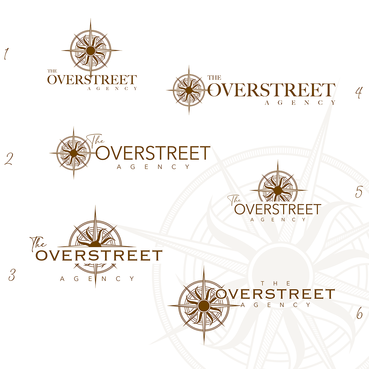
For an insurance agency helping people navigate important choices, a compass creates a fitting visual foundation. Nuzu explored several arrangements of the compass symbol and agency name, from stacked marks to horizontal signatures.
Start with a mark that works in one color
The first contact sheet focused on the symbol and typography before the final color palette. This approach makes it easier to judge the strength of the mark and consider applications such as embroidery or printing where full color may not be available.
The design process
Refine the chosen direction
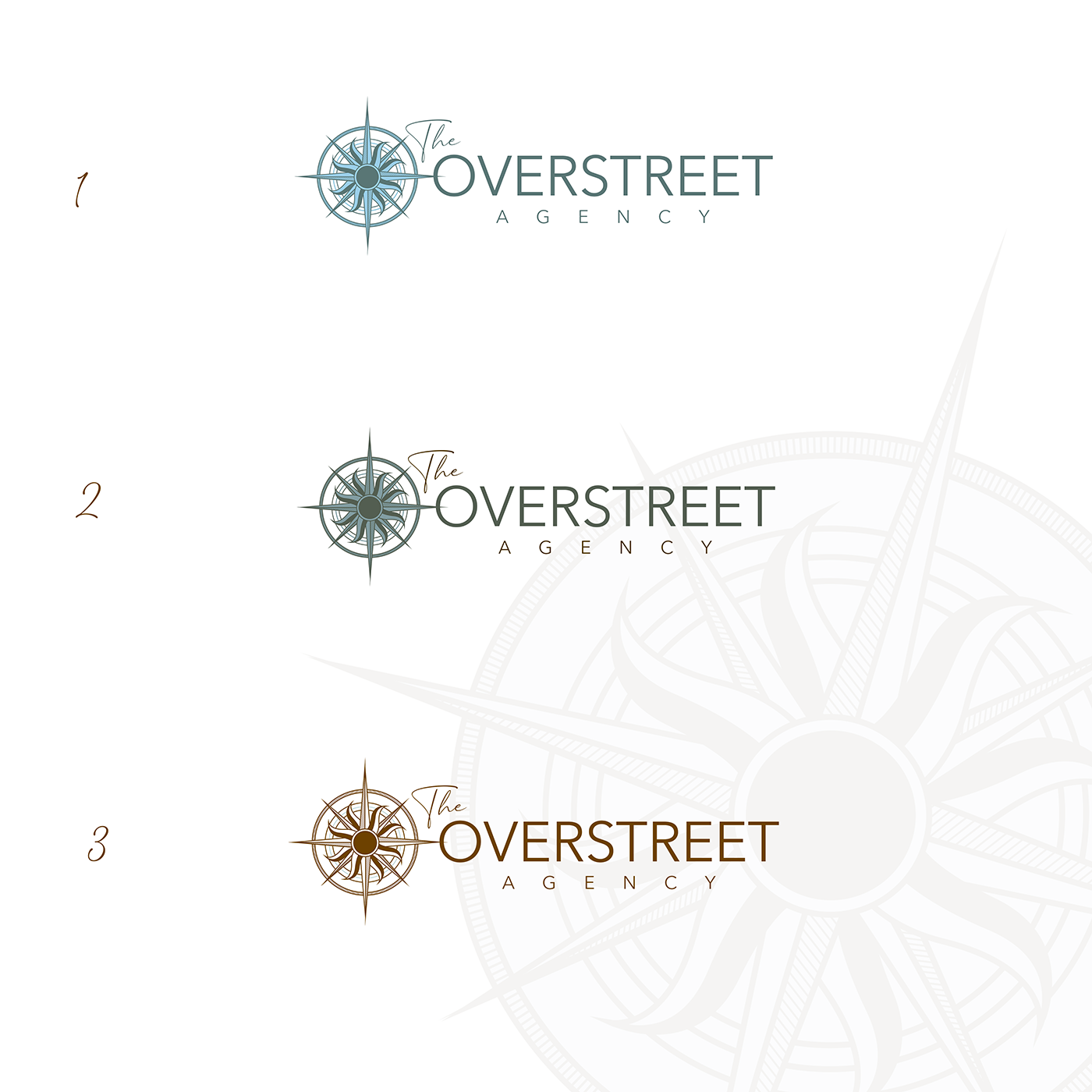
After choosing a concept, the agency reviewed font and color variations and two treatments of the compass center. The selected version uses the circular center, paired with a clear agency name and a more expressive treatment of “The.” The final palette was then carried into the website design.
The final identity

Files ready for the next application
Nuzu supplied the final identity in multiple formats, including vector artwork and EPS files for printers. The handoff gives the agency a consistent source for website graphics and future branded materials.
What Nuzu delivered
- Logo concept development and contact sheets
- Compass symbol, typography, and color exploration
- Client-led selection and design refinement
- Final vector artwork and printer-ready EPS files
- Brand integration into the agency website
Give your business a recognizable identity. Start your design project ↗
YOUR NEXT CHAPTER